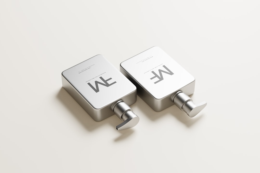
Design Neumorphism represents a distinctive aesthetic in user interface design, captivating many with its unique visual style. This trend merges elements of flat design with the tactile realism of skeuomorphism, resulting in a "soft UI" appearance. It aims to create an interface where elements appear to extrude from or indent into the background, giving a subtle, three-dimensional depth. Understanding Design Neumorphism is crucial for designers looking to implement a fresh, modern, yet familiar feel in their applications.
What is Design Neumorphism?
Essentially, neumorphism is a visual design style characterized by elements that appear to be molded from the background surface itself. This is achieved primarily through the clever use of shadows and highlights. Instead of elements floating above the background, they seem to be part of it, offering a sense of depth and interaction without sharp edges or high contrast.
This particular aesthetic gained significant traction for its gentle, sophisticated appearance. Developers and designers often gravitate towards neumorphic design for projects seeking a minimalist yet interactive feel. It offers a fresh alternative to purely flat designs, providing a perception of physical interaction.
Key Characteristics of Neumorphic Design
Several defining features set this design style apart. Fundamentally, neumorphic elements eschew traditional borders and harsh contrasts. Instead, they rely on a nuanced interplay of light and shadow, which is essential for rendering their unique look.
- Subtle Shadows: Typically, two contrasting shadows are used – one light and one dark. These shadows cast in opposite directions simulate a light source, creating the embossed or debossed effect.
- Monochromatic Palette: Often, neumorphism employs a near-monochromatic color scheme. This choice helps to emphasize the soft shadows and highlights, preventing the interface from appearing busy or cluttered.
- Soft Edges: Components in a neumorphic interface generally feature rounded corners and smooth transitions. This contributes to the overall soft and organic feel of the user experience.
- Background Integration: Elements are not distinct objects on a background; rather, they seem to be part of the background material itself. This integration is a core principle of the aesthetic.
The Allure of Soft UI: Benefits
Many designers are drawn to the soft UI aesthetic due to its inherent elegance and perceived modernity. This particular style can imbue applications with a premium, high-end feel. Moreover, its gentle nature can reduce visual clutter, promoting a cleaner and more focused user experience.
Furthermore, the subtle depth provided by neumorphic elements can enhance user interaction. While not as overtly skeuomorphic as older designs, the perception of physical buttons and toggles can make an interface more intuitive to navigate. Consequently, users might find such applications more engaging and easier to understand.
Challenges and Considerations for Neumorphic Interfaces
Despite its aesthetic appeal, implementing neumorphic design presents several practical hurdles. Firstly, accessibility can be a significant concern. The low contrast nature of many neumorphic elements, relying on subtle shadows rather than distinct color differences, may pose challenges for users with visual impairments. Therefore, careful consideration of contrast ratios is paramount.
Secondly, developing a consistent and effective neumorphic look demands precision. Inconsistent shadow application or improper use of color can quickly undermine the intended soft aesthetic, making elements look flat or unpolished. Furthermore, the style is not universally suitable for all applications; complex data-heavy interfaces might struggle with this minimalist approach.
Best Practices for Implementing Neumorphism
To successfully integrate this modern aesthetic, consider these guidelines. Implementing Design Neumorphism effectively requires a nuanced approach to light and shadow.
- Prioritize Accessibility: Always ensure sufficient contrast for text and interactive elements. For guidance on creating inclusive designs, resources on Material Design accessibility offer valuable insights, particularly for users with low vision.
- Strategic Use of Color: While often monochromatic, judicious use of accent colors can highlight key interactive elements without sacrificing the soft aesthetic.
- Consistent Light Source: Maintain a single, consistent light source across your entire interface. This ensures believable shadows and highlights, enhancing the 3D illusion.
- Embrace Moderation: Not every element needs to be neumorphic. Combine it with flat elements where clarity or data density is more critical, creating a balanced UI.
- Test Thoroughly: User test your neumorphic interfaces to gauge intuitiveness and user preference. Gather feedback on interactivity and visual comfort.
Distinguishing Neumorphism from Skeuomorphism
While neumorphism is sometimes called "skeuomorphism 2.0," it possesses distinct differences from traditional skeuomorphism. Classic skeuomorphism mimicked real-world objects exactly, like a calculator app looking precisely like a physical calculator. This often involved textures, gradients, and detailed ornamentation.
In contrast, the neumorphic style focuses on a more abstract, tactile feel without directly replicating real-world textures or objects. It suggests depth and interaction through subtle relief rather than overt mimicry. The aim is to create a soft, digital material feel, which is a significant departure from the maximalist approach of its predecessor. Therefore, this softer interpretation of realism truly sets it apart.
The Future of Neumorphism in UI/UX
Predicting the long-term trajectory of any design trend is challenging; however, neumorphism appears to be evolving. For broader context on this, exploring current web design trends can offer valuable insights into its potential longevity and evolution. While it may not become the dominant UI paradigm, its influence on subtle depth and tactile interaction is undeniable. Many designers are now integrating elements of soft UI into broader design systems, rather than adopting a pure, end-to-end neumorphic approach.
This trend toward selective application indicates a maturity in its usage. Therefore, we will likely see more hybrid designs that leverage the best aspects of neumorphism—its gentle aesthetic and perceived intuitiveness—without falling into its accessibility pitfalls. Ultimately, its contribution lies in expanding the visual language of digital interfaces.
Conclusion
Design Neumorphism has certainly carved out a niche in the UI/UX landscape. Its distinct soft UI aesthetic offers a compelling alternative to traditional flat designs, emphasizing a sense of depth and tactile interaction. While it comes with specific challenges, particularly regarding accessibility and scalability, its principles of subtle light and shadow provide valuable lessons for creating visually engaging interfaces. Ultimately, understanding and strategically applying the tenets of neumorphic design can elevate a digital product's user experience.
Frequently Asked Questions
What makes a “perfect” AI-generated image?
It depends on your goal (photorealism, style, consistency). Use a clear brief (subject, style, lighting, framing) and iterate with variations.
How do I write a strong prompt for Design Neumorphism?
Use a simple formula: subject + context + style + lighting + composition + detail. Add constraints, then refine in small iterations.
What are negative prompts used for?
They specify what to avoid (blur, watermark, bad anatomy). They improve consistency and reduce common artifacts.
How can I improve the final quality (upscaling)?
Start with a solid composition, then upscale, fix local issues with inpainting, and apply light post-processing when needed.